-->
DISCLOSURE: This blog contains Google Adsense ads and affiliate links to Creativebug via which potential commissions are earned when visitors click through.

Search This Blog > > >

Showing posts with label fabric design. Show all posts

Saturday, 19 July 2025

Recycled Creativity Revisited

"Whirling Wood Grain" by eSheep Designs
Taking some time for surface design...
A couple of years ago, I recycled an old fabric design into a new entry for one of Spoonflower's design challenges.

It was also the last time I entered one of them, before the ones that I'm posting about right now.
  
Surprising, in a way, since I had thought – with not blogging regularly  – that I would have more time to fiddle with surface design as well. Turns out that a lot of things didn't pan out the way I anticipated that they might last year.

Which is not to say that I had actual plans that didn't get executed. I quite literally had no plans, so whatever got accomplished in 2024, I'm actually quite fine with it all.

Anyway, to get back to the topic at hand, the first Spoonflower challenge last December was called Cabincore Wallpaper. The aim was for designs "that encapsulate the essence of cabin life, blending comfort with a touch of the great outdoors." Even though I wasn't enthralled with the theme, I thought I could do something with it.

Growing up, I lived in two houses that actually had a bit of a cabin vibe to them. The first had a family room that featured wood shakes on two walls, which was put in by the original owners. In the second home, my parents were the ones who decided to panel the basement walls in quintessential faux woodgrain.


Maybe because of all that "woody-ness" from my youth, I am loathe to feature brown wood anywhere in my own home. So for a design challenge that is supposed to invoke cabin life, what would I go with?

Wood, of course.

But this is a surface design for a wallpaper, so it doesn't have to look like real wood, in either colour or substance. With that in mind, I thought about concocting something with a stylized wood grain. My first attempt was tossed into the garbage bin after wrestling with it for a day. Truly, I am a big proponent of saving creative attempts – and in fact, doing so and taking advantage of that is the overall theme of this post – but this one wasn't up to snuff in so many ways.

I realized that part of the problem was that – not for the first time – I wasn't feeling totally "into" it and therefore did not have the requisite mojo. To address that, I decided to look back into my design archives for some inspo.

eSheep Designs wallpaper design "Spin Me Good"
"Spin Me Good" wallpaper design...

Because this is a wallpaper challenge, the underlying elements have to be bigger. Therefore, my main sources of recycled creativity would likely come from previous wallpaper designs. I ended up here, from a 2018 black and white challenge... specifically, design #3.

I eventually named it, but it remained a private design and has never been proofed. I saw potential in how the concentric circles could be interpreted as the rings on a cross section of a tree.

With a little bit of help from PSP's deformations and tiling effects, I ended up with this seamless tile.

First iteration of "Whirling Wood Grain" by eSheep Designs
The genesis of my Whirling Wood Grain surface design...

And yes, the first colour that I chose was a reddish shade of brown. Eventually, it was lightened up and after a few iterations, I got this:

"Whirling Wood Grain" by eSheep Designs
I thought I was done at this point...

Even though I worked with this lighter shade of tan for several days, I felt the urge to explore a different colour altogether.

The first one I tried was grey, which looked fine, but perhaps too sterile for the theme. No matter the season, I believe cabin life should always have a "warm" vibe, so it was back to the drawing board to choose some colour. I settled on an olive green shade for its close association with tan/brown. My first attempt is this one below.

"Whirling Wood Grain" by eSheep Designs
Colorized to green...

I eventually deemed it still too dark. Apparently there is a trend towards dark wallpaper, but I cannot imagine it being a good choice for cabin life, with dim lighting often being prevalent in cabins as it is.

Taking a closer look, I decided that lightening up the background would suffice. I still wasn't totally sold on it, but I eventually ran out of time – not to mention interest – to make it different, so what you see below is what I eventually entered. It's called Whirling Wood Grain (Olive).

"Whirling Wood Grain (Olive)" by eSheep Designs
My eventual entry...

For a design that I personally wasn't in love with, it did about how I expected it would in the challenge. (Ironically, it has received more attention than my Ode to the Canadian Penny design, which I like much, much better and that would also make a terrific cabin wallpaper.)


MARK YOUR CALENDAR!

July 28- August 3
[affiliate link]


Immediately following this design challenge was another wallpaper challenge to promote Pantone's colour for 2025: Mocha Mousse.

Almost Argyle Fabric design by eSheep Designs
For this, I went back to 2021, when Pantone's colour of the year was actually two selections: Ultimate Gray and Illuminating Yellow. Shown on a pillow sham at right is my alternate entry – Almost Argyle – for that competition. (My actual entry was Feel Like Playing Jacks.) 

In the same manner as described for the previous design, I took the main elements and tweaked them with the colours that were permitted; Mocha Mousse was the main one, but the following shades of cream and brown were permitted alongside: Cannoli Cream, Cream Tan, Safari, Sirocco, Chanterelle, Baltic Amber, and Chocolate Martini.
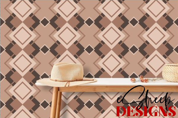
Pantone 2025 Wallpaper by eSheep Designs
Third attempt...

We were given the hex codes for the above, but no "paint chips" to see what they looked like, so it was a bit of a trial and error to arrive at what would be a pleasing mix for the existing design. My first attempt was too monochrome. I deemed it to be blah and reassigned the colours on the various shapes, settling on three others besides the Mocha Mousse: Chocolate Martini (the darkest shade shown above), Sirocco (the second lightest), and Cream Tan (the lightest).

Pantone 2025 Wallpaper by eSheep Designs
Sixth attempt...

I worked my way up to a sixth iteration before deciding that I was mostly satisfied. Mostly. I had taken away stuff and added stuff and was still not entirely finished, but it was close. After being reminded that Mocha Mousse was supposed to be the dominant colour, I rejigged some elements and arrived at my eighth and final iteration.

If you haven't figured it out, Mocha Mousse is the colour of the interior of all the diamond shapes. (I ended up naming this Mocha Mousse & Friends Argyle.)

Mocha Mousse & Friends Argyle wallpaper by eSheep Designs
This was my entry...

Even though I had only had four days to work on this one before the deadline, I must say that I ended up liking this entry much more than the one for the previous challenge. (Must have been getting into my "vibe".)

After I submitted, I discovered that the next challenge had the same theme, only for fabric, with different complementary colours... so it was back to the drawing board once again. This time, I found myself diving into my 2020 archives, to a limited palette challenge from early that year involving shades of "classic blue". The alternate that I created for that competition was Yarn Cross Stitch in Classic Blue.

I won't bore you with details of the process, but what I did was revamp the "stitch" elements – to convert them into petals – and then replaced the shades of blue with Mocha Mousse, Laurel Oak (the bluey-gray one), Buffed Beige (the lightest one) and Coffee Quartz (the darkest).

Here is the design that eventually became my entry:

Mocha Mousse Blossoms Pantone 2025 by eSheep Designs
This one is called Mocha Mousse Blossoms...

In the two weeks that were allotted to the voting process, it got sufficiently "favourite-ed" by members of the Spoonflower community that it jumped into third place out of all the fabrics that I'd ever designed... right behind my Pride & Prejudice Text (in White) and Pride & Prejudice Text (in Black). (Voting-wise, the final number was disappointing by comparison, but I'm still learning the craft and have no expectations of challenging for any top spots!)

Entries were pictured thusly for voting purposes:

Mocha Mousse Blossoms Pantone 2025 by eSheep Designs
Fabric on a chair...

The themes of the next two challenges did not ring my bell, but the one after caught my attention: sophisticated stripes. The design prompt in this case was to "reinterpret a classic and create an entry that makes a sophisticated statement." 

I like stripes, even when they're as simple as this:

Yellow & Gray Stripes fabric by eSheep Designs
Yellow & Gray Stripes Spoonflower sheet set...

Back in February of 2016, I came up with the following stripe-y pattern, the inspiration for which was discussed in this post:

Stripes (Blanche) by eSheep Designs
Inspiration design...

I liked the distribution of stripes in terms of number and size, and wanted to put some different colours to it to create something new. However, knowing that I have no talent for creating beautifully coordinated palettes, I had to consult visme for inspiration.

I can honestly say that I had forgotten the official name of the design challenge at this point, but when I scrolled through the colour palettes, the one that spoke to me was actually called "Sophisticated and Calm"... coincidence or what?

Sophisticated and Calm Colour Palette from Visme.com
image courtesy of visme.com...

My first design using those five colours, called Sophisticated Stripes & Dots, is shown below. It's simple and has a 3D vibe to it.

Sophisticated Stripes & Dots by eSheep Designs
Design #1...

I liked it enough to keep it as an actual design, but with time to play with the concept, it evolved. A couple of days later, I had the beginnings of my eventual entry.

Early Laced Up Ribbons by eSheep Designs
The beginnings of my final design..

Similar to how the cross-stitches were employed, I drew a small slash and put some dots underneath at both ends to create the illusion of eyelets. Through the magic of a mirrored pattern repeat, it looks like ribbons joined with laces. Over the next hours of playing with it, I added another row of dots to the black "ribbon" and narrowed the beige trim along its edge. The final step was to add some contrast detail to the eyelets, all of which you can clearly see below.
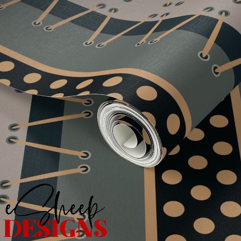
Laced Up Ribbons Wallpaper by eSheep Designs
Final design shown on wallpaper...

For voting purposes, entries were shown as wallpaper, but I think the design makes a striking fabric choice as well. (It's called Laced Up Ribbons.) Here it is as part of a bedding ensemble.

Laced Up Ribbons by eSheep Designs
Pillow sham & sheet set (all mockups courtesy of Spoonflower)...

This time, favourite-ing by the Spoonflower community boosted this design above my black P&P fabric into second place. (It was eventually supplanted by my entry into the Novelty Paisley challenge, which was subsequently exceeded by yet another, Egyptian Inspired Art Deco.)

I hadn't entered one of these competitions in over a year, and then suddenly it was five within three months. All of it possible because I had ready made inspiration to draw from... which is a reminder once again that we should never toss away our creative efforts. You never know what circumstance might arise to make something relevant and useful.

'Til next... 🇨🇦🍁


Saturday, 17 May 2025

The Paisley Project 2.0

paisleys by eSheep Designs
A portion of my new paisley fabric design...
Nine years ago, I designed a collection of fabrics featuring the very retro pattern known as paisley. I did it as a tribute to my mom, who has always been quite a fan of that curly teardrop form.

The project was also the foundation of an extensive learning experience for me, as I took a design that I originally drew on paper and then scanned into my computer for tweaking via Paint Shop Pro.

Back then, it truly was a matter of "tweaking," as I did not use the program's vector drawing tools to reproduce the outlines. (Quite honestly, I wasn't knowledgeable enough about how to use them at the time.)

paisleys by eSheep Designs
The painstaking process of vectorizing a hand drawing...

With more years of experience under my belt, I recently took some of those same paisleys and rejigged them into scalable vectors to create a new design for a Spoonflower challenge called Novelty Paisley.

Actually, this time, there was also a first attempt done on paper by hand. My doodling ended up transforming paisleys into fish. At that point, I decided that instead of creating new fishy paisleys from scratch, I would go back to the ones I already had in my archives and turn some of them into koi.


The vectorizing activity was not quickly accomplished, but it didn't take as long as I thought it might. I naturally turned to my drawing tablet first but found it more time consuming to trace with than the mouse. (It was probably because I have been out of practice using it.) Without too many issues, however, I soon had the following:

paisleys by eSheep Designs
Core elements vectorized...

The smaller fish are just scaled down versions of the big one, but I gave myself three unique paisleys to work with. The next step was to throw down a serviceable pattern using those shapes, with the end result of achieving a seamless tile.

As you might expect, the very first version was just a simple line drawing, black on a white background. I experimented with a gray background next, arriving at two versions, one light and one dark.

Dancing Paisley Koi fabric by eSheep Designs
A light gray version...

To add a bit of dimension, I then played around with the layers, giving some elements greater or lesser intensity.

Dancing Paisley Koi fabric by eSheep Designs
A dark gray version...

A version of the above design is actually for sale in my shop.

I did ultimately decide that I didn't want grayscale for my entry, however, so I reversed the original drawing and started working with white lines on a black background.

Dancing Paisley Koi fabric by eSheep Designs
Original drawing reversed...

Those of you familiar with my past projects may know that I like to throw some red in with my black and white combos, so that was the natural progression with this design as I continued to make changes.

Dancing Paisley Koi fabric by eSheep Designs
Adding some red...

With the colour scheme decided on, it was then a matter of going back and forth, modifying the drawing to add red to different spots and changing the thickness of the lines around various elements, to uploading the changes to Spoonflower to see the results.

Spoonflower used to require designers to proof their creations by purchasing at least a swatch. They now have an online proofing process whereby the design is magnified by A LOT so that we can see even a pixel being out of place. Quite convenient and of course, it reduces the amount of time (not to mention money) needed to put a design out and ready for selling.


Check out crafty classes at Creativebug!
[affiliate link]


After fifteen iterations, I had my final design, which I decided to call Dancing Paisley Koi.

Dancing Paisley Koi fabric by eSheep Designs
Final entry...

You wouldn't believe how much indecision I had over whether to choose this one, or the fourteenth one, or the thirteenth one as my entry. Given that no one would ever be the wiser as to the slight differences among them, it was an insane amount of consideration. As a point of fact, from number nine onwards, you'd would be hard pressed to tell what had changed, even if I showed them all to you.

I've never been one to seek perfection – and I wasn't doing that here – but sometimes in these design situations, you just want it to be "just right"... whatever that means.

You can see all of my paisley fabric creations here.

'Til next... 🇨🇦🍁

Saturday, 18 February 2023

Recycling Your Creativity

"original" creativity by eSheep Designs
How I ultimately recycled this design...
We talk about recycling materials when we sew and craft, but have you ever heard about recycling your creativity?

Perhaps it's more of a relatable concept for those of us who also dabble in design, but even mere makers can sometimes have an inspired idea that goes sideways and just doesn't work for a current project.

Does that mean it's not a good idea or design? Certainly not. It just doesn't fit the current application.

Take the sewing technique of ruching. Employed in the right area — along a sleeve or at the side of a form-fitting top — it can add a stylish touch to an otherwise mundane garment. But it doesn't work everywhere.

Designer Selvage Purse Charm by eSheep Designs
My designer purse charm with reverse appliqué...
For an example closer to home (since I really don't sew clothing), when I made my FrankenPurse, I added a small reverse appliqué element to the exterior. Had someone told me it would be totally hidden from view once the bag was finished (lost in the pleats), I wouldn't have bothered. But that doesn't mean that the whole idea should be tossed. In fact, I later featured the technique on a designer purse charm that I made for the same bag.


When I first started playing with surface design, I read somewhere that we should never delete anything that we ultimately decide not to use for a given purpose. The point being that while it may not fit the present circumstances, who's to say that it won't fit other circumstances down the road?

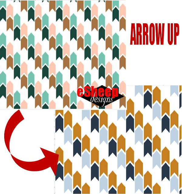
I took the advice to heart and have largely retained everything I've ever created in terms of a surface design (i.e., for fabric or wallpaper). My first instance of recycling came when this abandoned design for a limited palette design Spoonflower challenge from July 2019 became my entry for another limited palette challenge two years later.

Arrow Up by eSheep Designs

A recycled fabric design...

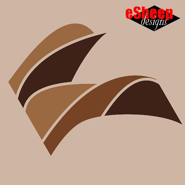
But before deciding to recycle the arrowheads, I had actually created the curvy design that you see at the top of this post. I had been experimenting with the freehand drawing tool in PSP, but for whatever reason was not satisfied with the result.

Fast forward to last month, or fifteen months later.

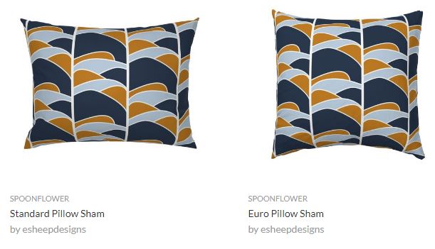
I hadn't taken part in a Spoonflower design challenge since April of 2022, so when the February design themes were announced, I pushed myself to go back to the drawing board. When I found the following screenshots in my archives, I felt like the design was worth revisiting.
image courtesy of Spoonflower
image courtesy of Spoonflower...

Therefore, in what has become a weirdly coincidental turn of events, the original design that I came up with for the limited palette challenge of October 2021 — which I ultimately discarded in favour of a recycled design from 2019 for the actual entry — was itself recently recycled into the entry for a limited palette challenge for January 2023. Comprende?

The January 24th challenge was called Earth Tone Throw Pillows, specifically aimed at producing a throw pillow design with a limited palette consisting of Sand (#CEB6A3), Dark Oak (#3E2118), Saddle (#764324) and Santa Fe (#9A6841).

While it was an automatic response to begin with typical pattern variants like this...

designs by eSheep Designs; images courtesy of Spoonflower
Mockups courtesy of Spoonflower...

... in the end, I opted to feature a (large) single element rather than a traditional (small) repeat.


Watch live classes for FREE at CreativeLive! Sign Up at CreativeLive
[affiliate link]


Don't assume that it was a simple decision that somehow naturally occurred to me.

After seeing less than awe-inspiring results through more than twelve (!) iterations, I actually wanted to give up until I thought I saw a stylized bird in the last version. With something concrete to focus on, it was then that I decided it should be featured as the main design element on a larger scale.

In Flight design element by eSheep Designs
Original "In Flight" design element...

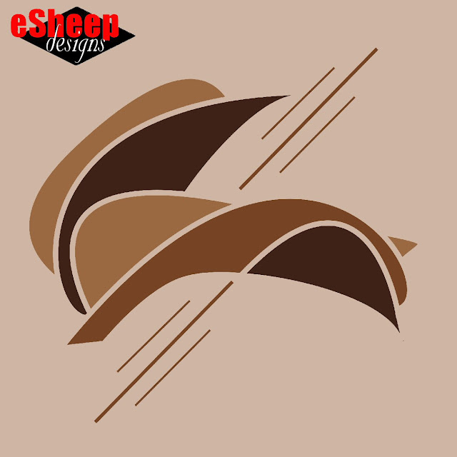
I started by rotating it twenty-five degrees. Then — since the two sides were no longer the image boundaries — the whole thing looked a little odd being trimmed so straight and even along the previous edges. Luckily, the original shapes from the underlying PSP file could still be edited to reveal more of their curves.

A little while later, it became this. Perhaps less like a bird now, but still organic and arguably more cohesive.

In Flight design element by eSheep Designs
Final "In Flight" design element...

At this point, I felt like my work was done. I was happy with what I had created out of my recycling effort.

Let this be a reminder to you that any idea that you that you don't use deserves to be memorialized for later. If you don't normally keep a record of your "light bulb" moments, consider doing so.

Here's how the design looks on a (mocked up) throw pillow.

In Flight Throw Pillow by eSheep Designs; mockup courtesy of Spoonflower
"In Flight" throw pillow mockup courtesy of Spoonflower...

Ironically, it states in the original specs for the design challenge that "Spoonflower throw pillows are best with repeating designs (rather than centered artwork)". Well, that may be so, but I wasn't feeling it here. (Although, to be clear, this is still a repeating design; it's just a very big repeat. That is, if you made curtains out of this fabric, you'd see multiple occurrences of the above element.)


Craft your way to spring with FREE access at Creativebug!
[affiliate link]


Of course, in the aftermath, I had to play with a version that's just for me, which led to another idea.
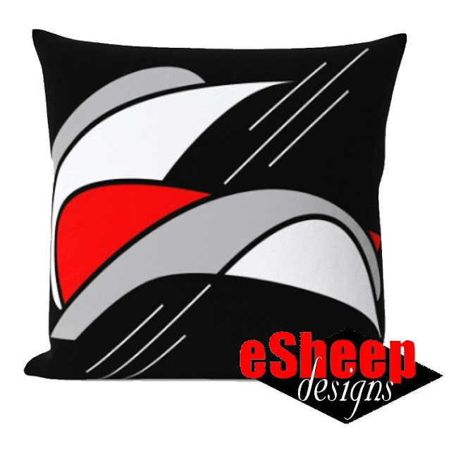
Black, White, Gray & Red eSheep themed throw pillow
As a more affordable way of enjoying Spoonflower home decor, it's relatively easy to take a fat quarter of one of their wide-width fabrics and sew a throw pillow (cover) yourself. (While it would be slightly smaller than a ready-made cover, you'd save a bundle, particularly during 50% off fat quarter sales.) I may rejig this design later to fit on a lightweight cotton twill fat quarter for that precise purpose.

What of the design challenge itself you may be asking? Apparently eight-two people deemed my design worthy of a vote. It was my second highest total ever (right behind the eight-four votes for this personal best, where my eventual entry was design #11), so I was quite happy with my first effort in almost a year. Certainly not bad for a recycled bit of creativity.

'Til next...

Saturday, 30 July 2022

Catharsis Through Creativity

Number 10
A tribute to the famous number ten of my youth...
About six years ago, I wrote about how our moms and dads help shape who we are. While my mother did not encourage me to sew, or even teach me to sew, she was an accomplished seamstress, so some of that had to have influenced me.

What I didn't mention in that post was the fact that my dad was responsible for my becoming a rabid hockey fan during those halcyon days of the 1970s.

In April of 1973, I must have crossed in front of the TV too many times while my dad was trying to follow a playoff game. He asked me to sit down and watch and said that maybe I'd like it. (Not that it was my first introduction to our national obsession; I'd had a casual interest in hockey ever since I learned how to skate.) He asked me which team I wanted to win and — in my simple juvenile way — I declared that of course, I had to cheer for Montreal because they were from Canada. Little did I know at the time that most teams from that era — regardless of which American city they represented — consisted mainly of Canadian players.

Guy Lafleur Skinny Fleece Scarf by eSheep Designs
Skinny single fat quarter scarf...
What I also didn't know at the time was that my dad had a preference for the other team on the ice. Luckily for me, he didn't exert any influence to get me to change my allegiance. That would have been a bummer since the Buffalo Sabres have still never won a championship and quite frankly, have arguably never been as good as they were back in the 1970s.

Call it fate, call it destiny, and certainly call it the luck of having been born at the right time, but almost fifty years on, I am so thankful that I picked the right team to cheer for. Not only did Montreal win the Stanley Cup the following month, they would go on to win four more times before the decade was out. During those years, I followed the team — and hockey in general — like it was my religion. Any fan old enough to remember those Montreal Canadiens understands how special and unique that period was. That was clearly evident in the outpouring of emotions that followed after we lost the heart and soul of that team to cancer this April.

For those who actually saw Guy Lafleur play, it suddenly hit home that they belonged to a privileged and enormously fortunate group of fans.


In the days following, I felt the need to have something tangible as a memento. (Aside from memorabilia that I still had from the 1970s.) In the immediate aftermath, I made a hanging "door plate" with an actual number ten on it.

Guy Lafleur fabric by eSheep Designs
Fabrics to commemorate Lafleur...
In my heart of hearts, however, I was really wanting something wearable. Something that would be instantly identifiable, that would communicate to like-minded others that I am part of that cohort.

Out of curiosity, I visited the NHL's online shop and found a lot of overpriced gear there. While the merchandise was official, it seemed crazy stupid — to me, anyway — to spend that kind of money on t-shirts and stuff that frankly didn't even look all that great. (The lowest price point that I found was a pair of socks selling for $22.99.)

One of the main reasons I've lapsed as a hockey fan over the past thirty years is the blatant and rampant monetization of everything related to the sport. The sheer passion and quintessential love of the game that used to be so honestly front and foremost is missing from today's version of professional hockey. With the in-person experience now being ruined by eardrum-splitting techno music and an incomprehensible desire for noise for the sake of noise, it doesn't help the cause that the on-ice product in this salary cap age is slowly being eroded by questionable officiating and momentum-sucking video reviews.

I guess you didn't figure on getting a sports editorial when you stopped by today, did ya??

Anyway, enough background. If you're still reading — and I would totally get it if you tuned out many paragraphs ago — the actual subject of today's post is the Spoonflower fabric that I eventually designed and how the creative process restored me.

Guy Lafleur fabric by eSheep Designs
This is actually an amalgamation of two separate designs originally created for a banner...

By late May, I knew that I wasn't ever going to buy any official merch. High prices notwithstanding, none of it appealed to me; the designs were boring beyond belief. Instead, I looked up the colour codes for the Canadiens' particular shades of red and blue and opened up my trusty Paint Shop Pro, determined to channel my feelings into some original designs.


Watch live classes for FREE at CreativeLive! Sign Up at CreativeLive
[affiliate link]


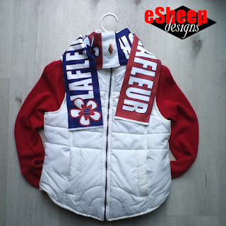
My first idea was to create a print that would translate well into a statement scarf. I was quite happy with how my skinny single fat quarter scarf worked out last Christmas and wanted to make another, also meant to be given away as a gift to a special person.

Guy Lafleur Skinny Fleece Scarf by eSheep Designs
An inexpensive option for a scarf...

The basic design features large white lettering on an alternating blue and red background, with coordinating flower and number "10" embellishments. (Lafleur of course, means "the flower" in English.)

Guy Lafleur Skinny Fleece Scarf by eSheep Designs
Making my own "merch"...
This one repeats exactly twice on a 28" x 18" fat quarter of fleece, which will produce a finished scarf measuring 4" wide x 58.5" long, or about 10cm x 148.5cm for my metric readers. The actual length will vary slightly depending on how much white border there is and how it's used. (I did the same thing as I did the last time and put it in the middle of the scarf, using the space to display my designer tag.) This one, however, is about an inch longer than the one I made last Christmas.

In terms of the sewing, this time I only zig-zagged the white area and the two ends. For the straight edges, I used a regular straight stitch. (Doing a prolonged zig-zag stitch is hard on the sewing machine, not to mention that it also uses a lot of thread.) The fleece does not fray, so it really doesn't matter what stitch is used.

Preserving an autograph...
A larger version of this same design features a single repeat on a fat quarter. For my one-time order of this piece — to make a 9" wide scarf for me — I superimposed a personalized autograph on the "R".

[Aside: I've said many times here that Spoonflower fabric is perfect for preserving personal memories like handwritten notes, recipes, doodles. You don't have to be artistically inclined to upload a simple scan of something and have it be preserved for posterity. What's more, if your piece is small enough to fit on an 8" x 8" swatch, it'll only cost you five bucks.]

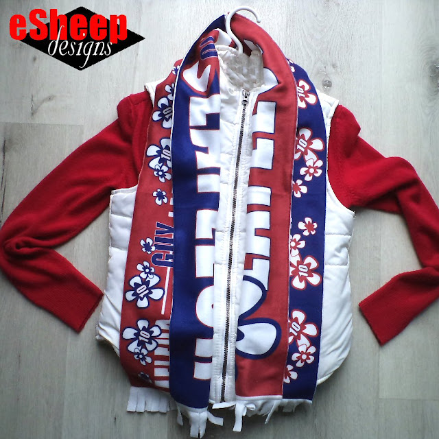
For my own scarf, I used both of the other fat quarters shown, cutting them in half and arranging them to get this look...

Guy Lafleur scarf by eSheep Designs
Two fat quarters to make a 9" wide scarf...

This time, I aligned the larger part of the white border at the ends to allow the addition of a short fringe. The two fat quarters produced a scarf with a more substantial girth, but the overall length is still about 59".

Since the fleece material has a bit of weight and heft, the scarf can actually be worn with one or the other side showing (i.e., it's reversible), or one of each if twisted in the back.

Guy Lafleur scarf by eSheep Designs
The two designs create a reversible scarf...

A statement piece is generally defined as the first thing that someone notices about your ensemble. I'll have to wait until cooler weather to see how well this scarf performs in that sense, but I get the feeling it might spark some discussion.

I will say for certain, however, that the whole process of creating this — the designing part on the computer and the cutting and sewing of the actual scarves — was a meaningful journey in itself. I've heard various people say that they don't have a creative bone in their body. The real story might be that they've never felt the need to be creative, but we all have the capacity.

I also believe harnessing one's creativity is an effective way to heal and re-energize one's spirit.


Check out crafty classes at Creativebug!
[affiliate link]


Some folks say they can't understand how the death of someone whom you really don't know can affect you so deeply.

I don't claim to have the full explanation, but in my case, it has to do with those tenuous ties to the past. I think we retain a connection to our younger selves — to essential innocence, to family, to safety (for those of us who were fortunate enough to have all of that) — as long as the people who played starring roles in our stories are alive. When the important people of our youth die, little bits of ourselves crumble into dust right along with them, snapping the threads that connect us to days gone by.

Guy Lafleur scarf by eSheep Designs
It's indeed a statement scarf...

Immersed in various 1970s era hockey videos recently, I've been transported back to truly simple times. More significantly, I've also revisited that day in April 1973 when my dad told me to sit down and watch. Who would have figured that it would be such a seminal moment, leading to a decade of spectacular memories that I feel privileged to have?

To take it further, who would have figured that just short of fifty years down the road — because of that moment — I would end up writing about making a scarf with Guy Lafleur's name on it?

In truth, it's so utterly bizarre, it can only be destiny.

'Til next...