
|
|
How I ultimately recycled this design... |
Perhaps it's more of a relatable concept for those of us who also dabble in
design, but even mere makers can sometimes have an inspired idea that goes
sideways and just doesn't work for a current project.
Does that mean it's not a good idea or design? Certainly not. It just doesn't
fit the current application.
Take the sewing technique of ruching. Employed in the right area —
along a sleeve or at the side of a form-fitting top — it can add a stylish
touch to an otherwise mundane garment. But it doesn't work everywhere.

|
| My designer purse charm with reverse appliqué... |
For an example closer to home (since
I really don't sew clothing), when I made my
FrankenPurse, I added a small reverse appliqué element to the exterior. Had someone told
me it would be totally hidden from view once the bag was finished (lost in the
pleats), I wouldn't have bothered. But that doesn't mean that the whole idea
should be tossed. In fact, I later featured the technique on a
designer purse charm
that I made for the same bag.

When I first started playing with surface design, I read somewhere that we
should never delete anything that we ultimately decide not to use for a
given purpose. The point being that while it may not fit the present
circumstances, who's to say that it won't fit other circumstances down the
road?
|
|
A recycled fabric design... |
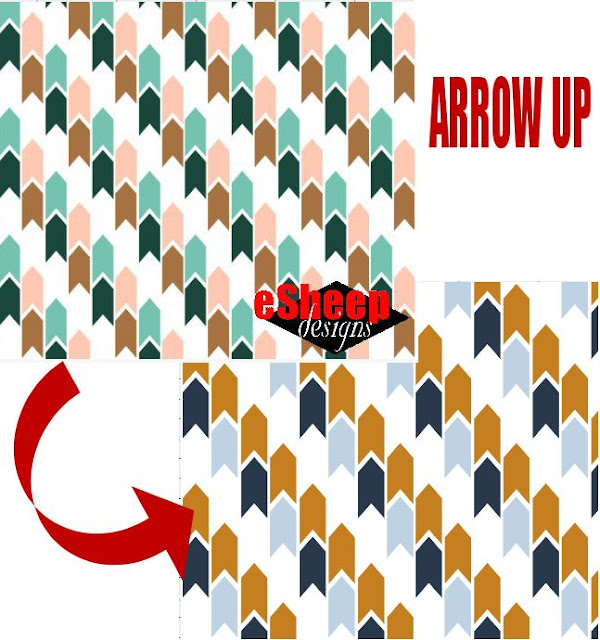
But before deciding to recycle the arrowheads, I had actually created the
curvy design that you see at the top of this post. I had been experimenting
with the freehand drawing tool in
PSP, but for whatever reason was not satisfied with the result.
Fast forward to last month, or fifteen months later.
I hadn't taken part in a Spoonflower design challenge since April of
2022, so when the February design themes were announced, I pushed myself to go
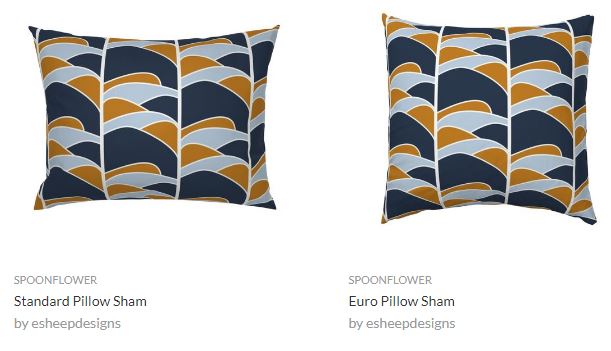
back to the drawing board. When I found the following screenshots in my
archives, I felt like the design was worth revisiting.
|
| image courtesy of Spoonflower... |
Therefore, in what has become a weirdly coincidental turn of events, the
original design that I came up with for the limited palette challenge
of October 2021 — which I ultimately discarded in favour of a recycled design
from 2019 for the actual entry — was itself recently recycled into the entry
for a limited palette challenge for January 2023. Comprende?
The January 24th challenge was called Earth Tone Throw Pillows,
specifically aimed at producing a throw pillow design with a limited palette
consisting of Sand (#CEB6A3), Dark Oak (#3E2118), Saddle (#764324) and Santa
Fe (#9A6841).
While it was an automatic response to begin with typical pattern variants like
this...

|
| Mockups courtesy of Spoonflower... |
... in the end, I opted to feature a (large) single element rather than a
traditional (small) repeat.

Don't assume that it was a simple decision that somehow naturally occurred to
me.
After seeing less than awe-inspiring results through more than twelve (!)
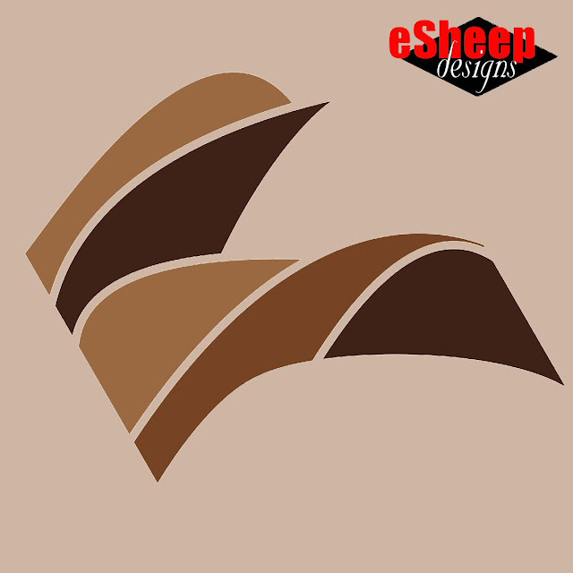
iterations, I actually wanted to give up until I thought I saw a stylized bird
in the last version. With something concrete to focus on, it was
then that I decided it should be featured as the main design element on
a larger scale.
|
| Original "In Flight" design element... |
I started by rotating it twenty-five degrees. Then — since the two sides were
no longer the image boundaries — the whole thing looked a little odd being
trimmed so straight and even along the previous edges. Luckily, the original
shapes from the underlying PSP file could still be edited to reveal
more of their curves.
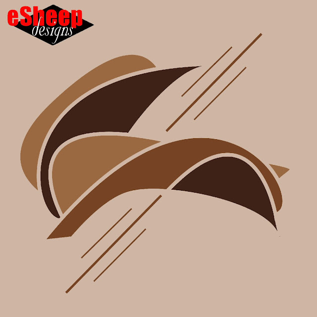
A little while later, it became this. Perhaps less like a bird now, but still
organic and arguably more cohesive.
|
| Final "In Flight" design element... |
At this point, I felt like my work was done. I was happy with what I had
created out of my recycling effort.
Let this be a reminder to you that any idea that you that you don't use
deserves to be memorialized for later. If you don't normally keep a record of
your "light bulb" moments, consider doing so.
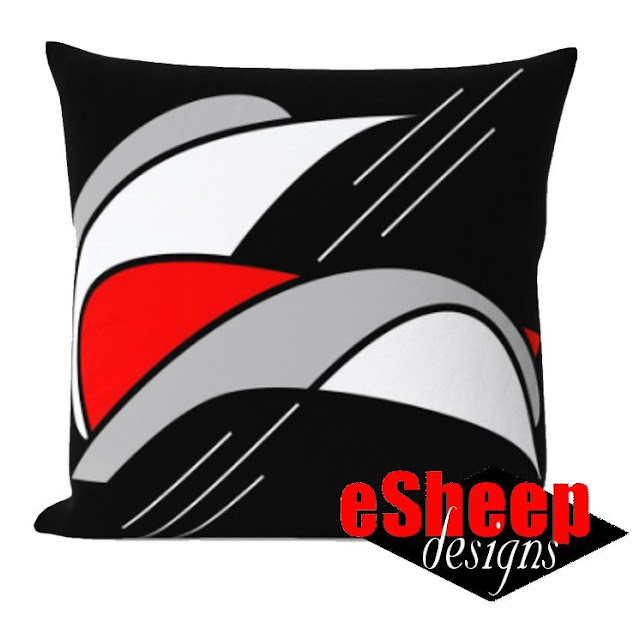
Here's how the design looks on a (mocked up) throw pillow.

|
| "In Flight" throw pillow mockup courtesy of Spoonflower... |
Ironically, it states in the original specs for the design challenge that
"Spoonflower throw pillows are best with repeating designs (rather than
centered artwork)". Well, that may be so, but I wasn't feeling it here. (Although, to be
clear, this is still a repeating design; it's just a very big repeat.
That is, if you made curtains out of this fabric, you'd see multiple
occurrences of the above element.)

Of course, in the aftermath, I had to play with a version that's just for me, which led to another idea.
As a more affordable way of enjoying Spoonflower home decor, it's
relatively easy to take a fat quarter of one of their wide-width fabrics
and sew a throw pillow (cover)
yourself. (While it would be slightly smaller than a ready-made cover, you'd
save a bundle, particularly during 50% off fat quarter sales.) I may rejig
this design later to fit on a
lightweight cotton twill fat quarter for that precise purpose.
What of the design challenge itself you may be asking? Apparently eight-two
people deemed my design worthy of a vote. It was my second highest total ever
(right behind the eight-four votes for this personal best, where my eventual entry was design #11), so I was quite happy with my
first effort in almost a year. Certainly not bad for a recycled bit of
creativity.


No comments:
Post a Comment
You have the power to brighten my day. Leave me a comment; I'd love to hear your thoughts... you can even remain ANONYMOUS! And rest assured that I acknowledge all comments, either here or via email. (That is, if you don't see a response from me here, I would have responded privately to the person.) Spam or generic comments with unrelated links, however, are promptly removed... and I may take appropriate action or report you to Google. Thanks for reading! (✿◠‿◠)