 |
| Four placemats in my noodle bowl fabric... |
Of the various Spoonflower design challenges that I've entered over the past few years, photographic entries have garnered the least amount of interest.
For example, even though I was quite pleased with my Vatican Spiral Stairs entry into the retro postcards competition, it only received 12 votes.
And in support of the idea that it's not just my photographics work not being appreciated, I've never seen such designs from anyone winding up in the top anything of the voting.
It doesn't help that most people don't bother effecting a seamless repeat with their photographic images. They usually consist of the rectangular picture repeated across the fabric with obvious borders; certainly not the best look. (In fact, the current Spoonflower challenge theme is a day at the lake and there is an unusual number of photographic entries that are styled exactly that way.)
When the April design challenges were announced with one having a theme of noodle bowls, I fully expected that the entries would be overrun with cutesy prints of oriental bowls, chopsticks, and cartoon-like noodles.
Not like I was about to join the crowd. As soon as the challenge came to my attention, my immediate thoughts turned to a bowl of noodle soup that I concocted a few years ago. Hubby was away; I was having dinner by myself and it was made out of leftovers. (A few pieces of roast duck on top of yu choy on top of broad rice noodles; hence the name of the resulting fabric, Roast Duck and Veggie Noodle Soup.)
I was so impressed with it that I took a photo. Not being a food blogger, I don't normally take photos of my meals.
 |
| This is the original photo... |
Naturally, it had to be turned into a fabric design. Because sometimes that's what designing is all about: the ability to turn a memory into something tangible, permanent, and never to be forgotten. It totally doesn't matter that it only received nine votes in the competition. I like it.
In fact, as soon as the next fat quarter sale rolled around in April, I picked up four of them in lightweight cotton twill, for the expressed purpose of turning them into placemats. (The print is well suited for such use as it will hide a multitude of food stains!)

One can, of course, purchase actual placemats from Roostery. This set of two costs $26 or $28, depending on fabric.
 |
| image courtesy of Roostery... |
They measure 19" x 13", with a plain white backing. The ones I made out of my fat quarters — five of which cost me essentially the same total price of $26 — are reversible, but are smaller at just under 17" x 11" (that size being ideal for our dining table).
 |
| One side quilted... |
I free motion quilted one side of each placemat.
 |
| Front and reverse views... |
My method was to cut one single rectangular 18" x 23" piece (out of one fat quarter, which measures 18" x 29" for the lightweight cotton twill), baste a smaller rectangle of an old fleece blanket to one half, quilt that half, then sew it up and turn it right side out.
 |
| Basted, quilted and later sewn together... |
I ran out of bobbin thread while top stitching the first one and subsequently decided not to top stitch at all, ultimately closing the gap with some ladder stitching instead.
 |
| Unquilted side... |
I ended up with four fairly substantial strips of fabric after I was done, which were surprisingly able to be pieced together into a fifth placemat.
 |
| The seam creates a unique spin on the design... |
I sometimes take piecing to extremes. Take a look below at what I did with my fusible fleece scraps.
 |
| Top: quilted side; bottom left: pieced fusible fleece; bottom right: (identical) back view |
This one was also finished differently, with opposing beveled corners. Oh, and I did top stitch the entire thing.
Getting five placemats out of four fat quarters was an unexpected bonus, to be sure. (I gave this last one to my mom.)

Back to my theory about how popular photo realism may or may not be to Spoonflower voters, I am going to test those waters again with my newest design.
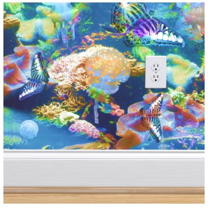
Next week's challenge is tropical surrealism themed wallpaper. Once more, I took some photos and cobbled them together to get this print.
 |
| Luminescent Ocean Dreams by eSheep Designs |
Granted, it probably looks a lot less photographic than the noodle bowl design — as a further nod to the "surrealism" part of the challenge — but everything you see here is/was real: the jellyfish, the butterflies, the underwater scenery.
 |
| mockup image courtesy of Roostery... |
The photos of the undersea creatures were taken at an aquarium and the butterfly image was captured at a botanical garden. Apart from colorization and transparency effects, nothing has been altered.
I don't expect this to wow the crowds, but again, I like it. ;-)
'Til next...


I love reading your thinking process and I hear both the joy and the frustration of your creative process. Thanks for sharing.
ReplyDelete